Color creates style and affects mood outside the home just as much as it does inside. The principals of using color are basically the same no matter what you’re designing. However, there are some things to keep in mind when coming up with color concepts in the landscape or garden.
- Repetition. Repeating colors throughout the yard creates unity, which is lovely when you’re trying to ‘paint a picture’. Repetition ties all the parts together, whether it’s through color, texture, or size. This isn’t to say that you have to use the same plants repeatedly, we’re just talking about the same colors. For example, if you have a group of yellow yarrow planted in one spot, you could add coreopsis or yellow lilies in another.
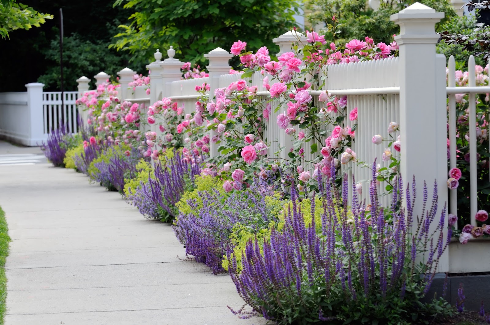
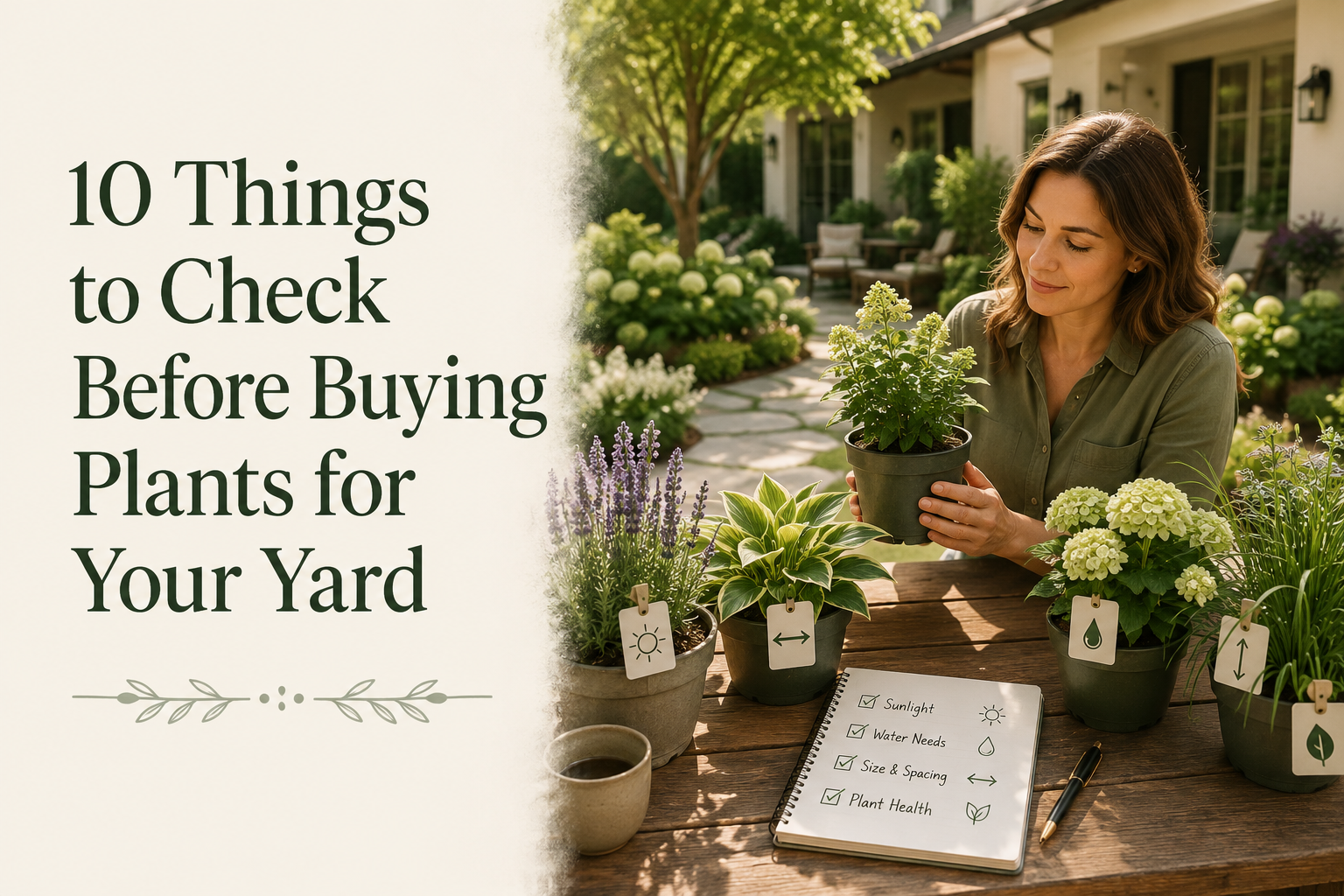
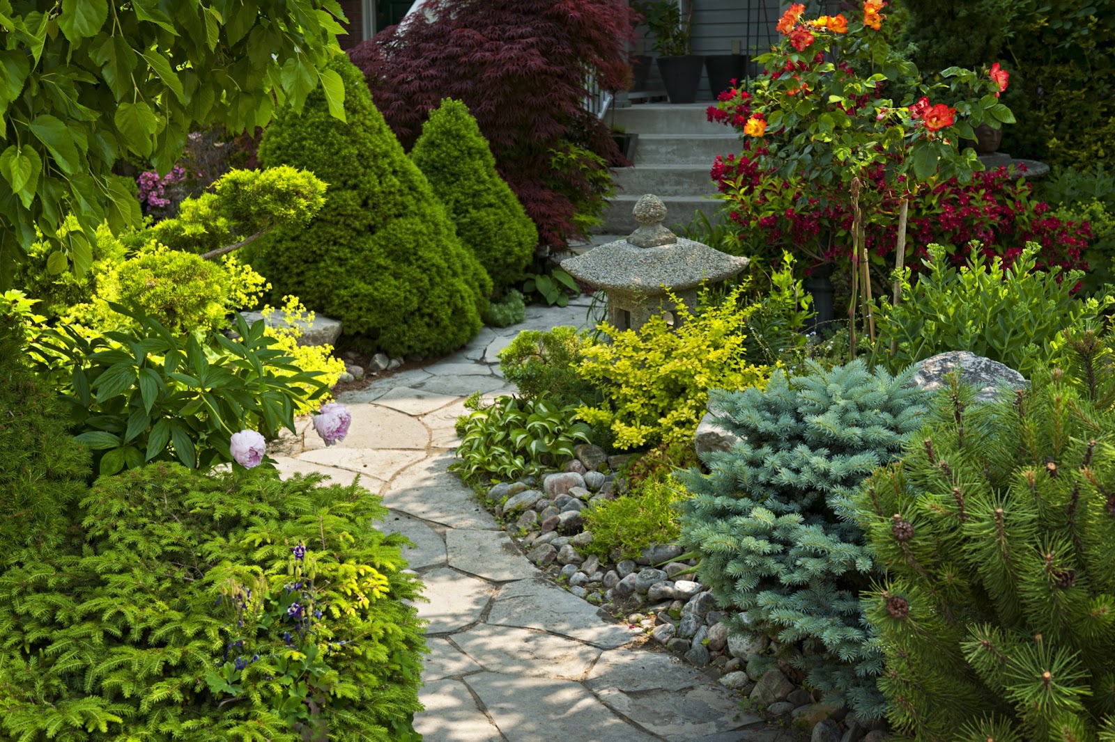
- Can You Have Too Much Color? That depends on what you’re after in terms of view. You can certainly plant as many colors as you’d like! However, if you’re going for a coherent scene then too many mixed colors can be distracting to the eye. Most professionals suggest using up to three basic colors in a small-space garden design. At first, this suggestion may sound limiting. But consider that this doesn't include the various green leaves and stems of the plants, so there's a lot to work with there. Plus, remember that utilizing a variety of plant species following that color scheme is encouraged. This means that there will be various shades of the colors in your scheme. For example, you could choose white, blue, and pink as a main group or yellow, orange, and red. Then look for a variety of plants at your local nursery that bloom in those colors. Another way to achieve color harmony is to use all warm colors or all cool colors.
- The Backdrop Matters. While you’re making color decisions, consider what is behind the flowers. If there isn’t anything there with color that could clash with your plantings such as trees, shrubs, etc., then carry on. However, often your flowering plants will be in front of house siding, fencing, brick, etc. For instance, if a brick building is painted a salmon color, consider planting blue or purple colors in front of it as opposed to pink or yellow.
- The Handy Color Wheel. Color wheels come in handy for about a million things and this is a great time to pull it out. This wheel makes it easy to decide which combinations are attractive to you. For example, colors that are on the opposite sides of the wheel are called ‘complementary’ colors such as red and green or orange and blue. Complimentary colors highlight each other so both of them share the spotlight.
- Elegance. If you’re looking for a formal, classic looking yard, you may want to consider ‘monochromatic’ colors. Monochromatic colors are basically the same color but used in different tones, shades, or textures. This works especially well in formal gardens, say in planting whites upon whites. The clever designer would make use of more than just flowers by incorporating ‘white’ leaves such as wooly Lamb’s ears or silvery Artemisias.
- Warm Colors. Bring a pick-me-up vibe to the landscape by planting warm colors like bright yellows, orange, red-violet, and red. Peach, pink, and gold will fit right into this color scheme, as well. Warm-colored gardens bring energy, warmth, and bring the entire yard to the forefront.
- Cool Colors. Cool colors like blue, purple, lavender, violet, and green create a tranquil, relaxing environment. Mauves and pinks can be integrated in the cool palette, as well. Blue and purple hues tend to recede and make them appear as if they are off in the distance as opposed to in front of you. On one hand, this illusion can make a yard seem larger than it is. However, if you’d like this group to stand out, combine them with cool whites or a bright yellow. Cool-colored gardens can bring a wonderful ‘cool down’ vibe to an otherwise hot area.
- Dramatic colors. Some of us have a flair for the dramatic and can’t resist vivid oranges and fiery reds! Vibrant colors are wonderful, but sometimes they can be a handful in a small space. For instance, red flowers scream for attention, and thus, too many of them can make the yard appear smaller. Plant them judiciously and they will be the life of the party. If you'd like to temper vivid colors, they can be quieted with whites or softer shades of red. Brilliant oranges can be softened with light yellow seated next to them.
- Bring in the Annuals. Perennial plants, trees, and shrubs make up the natural bones of a landscape, but annuals can bring the vision home. Annuals are the Swiss army knives of the gardening world. Utilize them to color areas in between perennials to punch up the design, or to add more color to a spot where the perennials have finished for the season.
- Use the iScape App Tools. Not sure where to start or which colors will work best with your garden scheme? Interested in seeing which color theme works in different areas of your yard? Create a variety of visions by using iScape’s app and move blooming plants around your yard in seconds!
Download iScape now and create landscape designs that improve curb appeal and transform gardens. iScape it!